‘Pressing matters’ 02 rough first pass
Posted on June 14, 2012 |
3 Comments
Filed under Drawings, Portfolio, Short film, Story
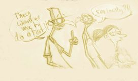
This is the second panel, you read it from left to right.

 |
|
 |
|
|
||
|
|
||
|
|
||
| |
Posted on June 14, 2012 |
3 Comments
Filed under Drawings, Portfolio, Short film, Story
This is the second panel, you read it from left to right.
Posted on June 13, 2012 |
1 Comment
Filed under Drawings, Portfolio, Short film, Story
You saw it here first ! 😉
Just so you don’t get mistaken, this is a short film I am working on. Well, I am only interested in telling stories those days so it might just stay in the state of boards.
This is the first time I use Photoshop for storyboarding so bare with me if it looks a bit rough. I will probably do a clean up version afterwards anyway. I have few more sheets coming in the next few days and you can expect the character design and the drawing style to change a bit as we go along. Let me know what you think!

Posted on June 11, 2012 |
4 Comments
Filed under Comics, Drawings

Posted on May 30, 2012 |
2 Comments
Filed under Drawings
This week, we were asked to design two characters interacting on a park bench. The designs were supposed to support a storytelling moment.
Here is what I came up with. I felt the need for a title as I wasn’t too sure people would understand what this is about…

Related post:
CGMA Character Design Week 04
Posted on May 29, 2012 |
4 Comments
Filed under Drawings, Education, Portfolio
I was browsing this kid’s blog the other day http://devon-stubblefield-interview.blogspot.fr/ and something he left in his comments section struck me.
I think he said he regularly fills up one sketchbook per week., granted they are only 100 pages, but still…
Anonymous asked: How big are the sketchbooks that you fill weekly? and like what kind of paper?
I use either a “Strathmore Sketchbook (green book) 100 sheets, 9×12 inches” or “Strathmore Windpower Sketch (blue book) 70 sheets, 9×12 inches.” The sketchbooks contain recycled sketch paper (fine tooth surface) (
In term of hours, he said that’s about 4 to 7 hours a day 😉
I never believed in talent so this only confirmed what I always thought. Success comes with dedication and drive. The more you want something, the more likely you are to reach it.
For the little story, the guy is only 17 years old, he already interned at Disney and is now heading for a summer internship at Pixar with my friend Pris and Richie…
Since I attended Animation Collaborative with a bunch of crazy artists (I will post about it as soon as I can), I have also started carrying a sketchbook and mechanical pencil in my hands at all time. As soon as I find myself waiting or idling, I open the sketchbook and start drawing. This is a great way to improve and also to remember situations and events.
Here are two of my latest sketches drawn while waiting for my friend Sebastien and an other one on the Ferry between France and England. I was really surprised to see that guy on the second drawing with a pen in his hand, I thought he was also sketching but he seemed to be composing some music. Nothing like pen and paper I am telling you! 😉


Posted on May 22, 2012 |
1 Comment
Filed under Character design, Drawings, Portfolio
This week we had to design the head of three librairians. I finally got around to create a Photoshop brush I am happy with. Not too clean and not too rough. I did a quick colour pass just for the sake of it. Nate showed us his painting technique this week so that is what I will be using in the future.
Till the very end of the week I wasn’t happy about the roughs I came up with. Only few days later I finally saw how I could make those designs more appealing and more cartoony. They still lack some acting Nate will probably say, let’s see.

Posted on May 18, 2012 |
1 Comment
Filed under Character design, Drawings, Portfolio, Tablet PC
Here is this week’s assignment. Nate asked us to create a line up with three pirates with contrasting shapes and proportions.
As usual I had a lot of fun exploring different shapes and silhouettes. Clean up was the most difficult part as usual. I had started with the Wacom tablet and fancy line work like Nate but I ended up reverting to pen and paper as I wasn’t getting anywhere.
If Photoshop wasn’t the industry standard for portfolios, I think I would stick to pen and paper. Mind you, I just saw some of Carter Goodrich’s sketches from Brave and he doesn’t seem to be bothered with modern design pipelines.
Anyway, here is what I did this week. Here is the final line up, a rough personality sketch and my research. The final cleanup was eventually done on the poor man’s Cintiq and Photoshop. Great progress compared to last week but still a long way to go before I can reach Nate’s great line work.


Related posts:
CGMA Character design week 01
Posted on May 11, 2012 |
4 Comments
Filed under Character design, Drawings, Education, Painting, Portfolio
This is my assignment for the CGMA Character Design workshop. We were to design a monster based on a basic circle, triangle or square shape. It is a similar exercise to what we did at the Animation Collaborative. Those three shapes are the basic foundations, the building blocks of strong character design.
Here is what I came up with. The line work and painting job are a bit poor for the moment. Nate will help us with those in the next few weeks so expect a new version soon. The bottom picture are explorations that I first did with pen and paper then cleaned up in Sketchbook pro.


Posted on April 3, 2012 |
Leave a Comment
Filed under Drawings, Portfolio
Last week I went to the beach to capture some surfin action, a bit of BMX and attended an art fair where friends were exhibiting.
Sometimes you don’t even need to travel to find interesting models, I was very lucky to have some carpenters on the roof opposite my house exhibiting … their naked flesh 😉

Biarritz March 2012

Carpenters at work + guest
Posted on March 24, 2012 |
5 Comments
Filed under Drawings
Alright I cheated a bit this week. The poses were supposed to be 1 minutes which I respected BUT I spent some additional time cleaning up the poses and fixing proportions. Without a very good understanding of anatomy and proportions, it is really really hard to draw a pose in less than a minute, especially when you have to turn the model around so the silhouette reads clearer. It must be possible with experience but I am not quite there yet. Give me few more weeks 😉


Related post:
Schoolism Gesture Drawing Week 02
Schoolism Gesture Drawing Week 01
